Flora in Winter 2024 Worcester Art Museum
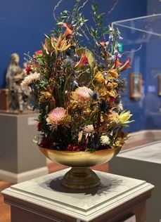
Veneziano’s “Panels from the Wings of a Triptych” – Floral Design by Maureen Christmas
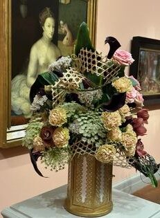
Woman at her Toilette – Created by Thelma Shoneman
Flora in Winter 2023 Worcester Art Museum
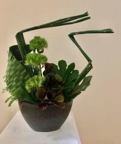
This design was created by Thelma Shoneman at a drop-in demonstration during the exhibition to show examples of leaf manipulation.
Flora in Winter 2022 Worcester Art Museum
Maureen Christmas created a floral design for the exhibit held on March 3-6.
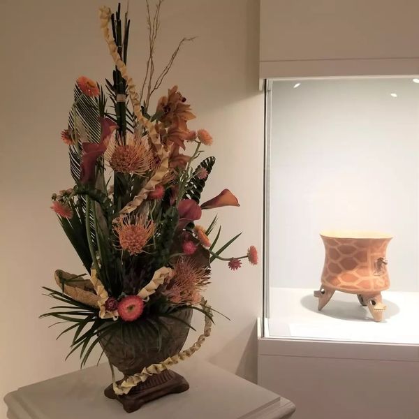
I was given a tripod vessel from 1000-1500 A.D. Costa Rica as inspiration for my design. Pattern and color were the two elements guiding my selection of materials. My color pallet was extracted from the subtleties of the container. As pattern was important to the design of the vessel, I incorporated patterns – both natural and manipulated – into my design. The vessel incorporated animals crafted with clay. I took the medium I use – plant material – to craft 3 tiny birds which are tucked in the design. I also braided teepee fern which mimic the wings on the birds. They were placed to imply the upper flare of the container.
Flora in Winter 2021 Worcester Art Museum
Maureen Christmas created two floral designs for the exhibit held on February 25-28.
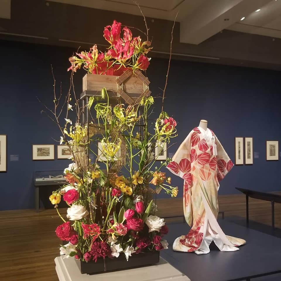
Flora in Winter 2021 at the Worcester Art Museum featured the first kimono commissioned as a work of art by a museum. I was honored to be one of two designers doing a video interpretation of it.
I focused on the ombre color story and the octagons (which represent the maple leaf and its changing colors – something meaningful to both cultures). The kimono used 7 different techniques – some new and some at risk of disappearing as artisans die. The number was chosen to represent the 7 hills of Worcester. I incorporated techniques from Japanese culture such as tatami weaving and embroidery (on leaves). I left the centers of my octagons open as a nod to the moongate in a Japanese garden. I approached the overall design with parallel placements of flower stems to give thoughts of a garden at the base while working toward a more contemporary feeling above following the colors of the kimono. Flowers were selected for color as well as their significance in Japanese culture.
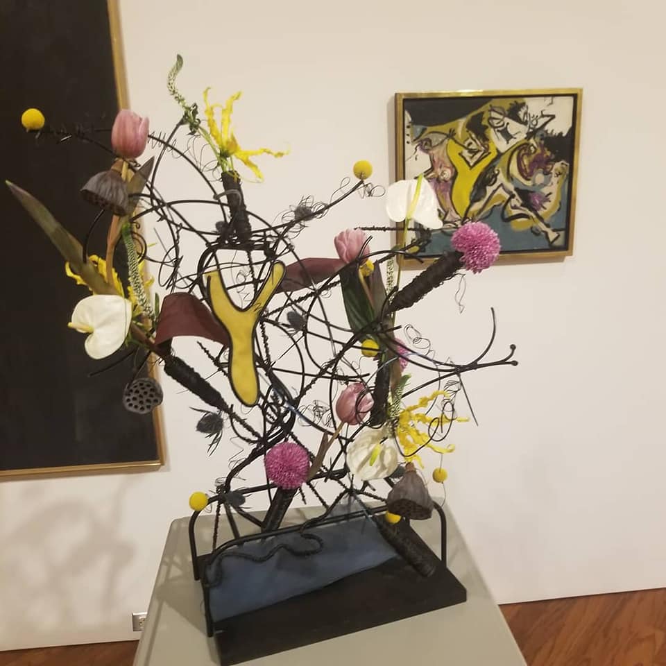
An interpretation of #jacksonpollock #EquineSeries .A fun experience focusing on line, shape and color. I selected flowers for their strong or unusual forms. The structure was created with 2 different stands from #blackwaterfloralaccessories, a plank of wood, arcs of black coated hardware wire from a 2015 Montreal workshop(!), zip ties, watertubes covered with annealed wire, smithersoasis megawire and metallic wire. Tulle was layered to mimic layers of paint. Some of the major shapes and lines were replicated to make a connection with the artwork but there is not an exact “this is this” correlation.
Flora in Winter 2020 Worcester Art Museum
Thelma Shoneman and Maureen Christmas created floral designs
for the exhibit held on January 23-26.
Thelma Shoneman’s Floral Design
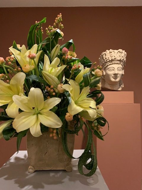
Thelma’s design was inspired by the Colossal Female Head, possibly Aphrodite, Greek,510-480 BCE. The elaborate detail in the crown fascinated her. She used curled Aspidistra with Ranunculus and Hypericum flowers inserted into the curls to capture the spirals and medallions in the crown. Lily grass blades were woven together with gold boullion wire to create dangles emulating her earrings and other jewelry. Pale yellow lilies captured the shape of some of the Goddess’ facial features.
Maureen Christmas’ Floral Design
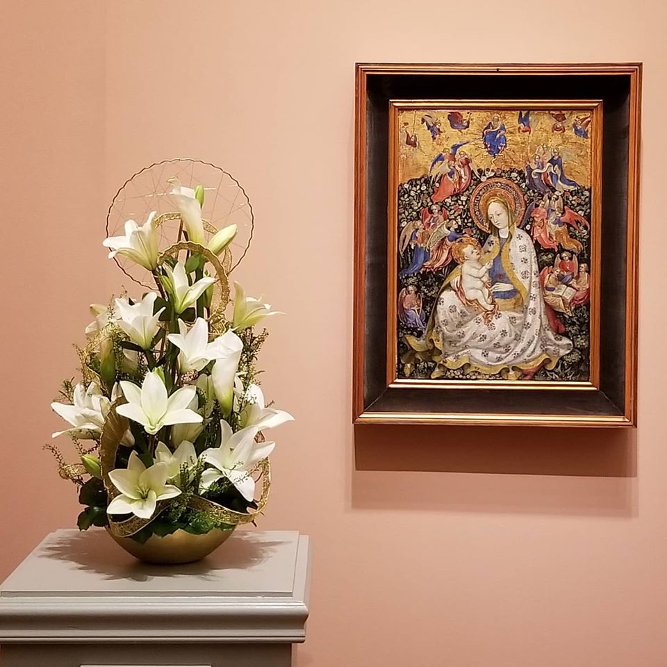
I approached my floral expression of the Madonna of Humility by Stephano Verona (circa 1430) by first looking at the main elements. The gold delineates the important features of the painting – the Madonna, Child and God above. I knew I wanted to interpret them by creating a structure using wirework techniques. The gold banding creates the rhythm in the design. Additional gold features repeat the color of the banding (contributing to rhythm) and reference the halos. I feel it is important to create a design that can stand on its own and not need the artwork to understand why something is placed where it is. For the design to have the appropriate balance, I placed the larger ‘halo’ at the bottom and the smaller one higher up in the design. I used crimp rings spray painted gold with @dmcolor and @oasisfloralproducts aluminum, metallic and bullion wires to create the structures.
Changes in painting style in the early 1400’s included layering of color to achieve transparent effects by using oil and egg-tempera paints. Can you see what I’ve used for transparency? Hopefully, you see the white through the lacey banding and, obviously, you can see components through the halos.
I selected white flowers because in deconstructing the painting, I saw that white was dominant. I didn’t choose roses – even though the setting is a rose garden – because I wanted smoother, more elongated forms. I considered using delphinium blooms with protea petals as a nod to the angels’ wings and blue elements but this diminished the elegance of the design. The pennycress woven through oasis mesh wire is a nod to the hedge.
The brass container, from a workshop with @christingeall, is lined with midnight foam oasis. Anticipating where the dowel rods for the structure would be, I carved out a section and filled it with styrofoam for stronger support.